Drive Direct: Best Practices for a High-Performing Hotel Website
Earlier this month, I was honored to speak at the Digital Hotelier Masterclass in London, England. Hosted by Masterclassing Inc., I was joined by about 40 or so hotel professionals from the greater London area, all facing the same challenge; how to reach occupancy and revenue targets while being strapped for time.
The reality is, most hoteliers are busy with the day-to-day demands of running a hotel. They don’t have enough time to devote to their digital marketing, and therefore aren’t seeing results from their most important sales and marketing channel – their hotel website.
In a poll we conducted in 2016, 60% of hoteliers said their biggest challenge was driving direct website conversions. And STR found that, on average, only one quarter of room nights for independent hotels are made via their hotel website.
So why is driving direct bookings such a challenge? Well, in an effort to make a great website, hoteliers often unknowingly move further away from achieving the goal of their website – converting lookers into bookers. They focus on things that aren’t adding value, versus providing a great user experience that makes the site easy to book through.
So let’s review some of the best practices I shared at the Digital Hotelier Masterclass on how to build a high-performing hotel website that converts.
1. Give Travel Shoppers What They Want
This is fairly straightforward, but unfortunately often overlooked. The best performing websites show the right type of content to travel shoppers. Their content is tailored to their target audience and focuses on what the consumer cares most about. For travel shoppers, it comes down to 4 main “wants”:
First, they want to know what makes your hotel different than others on their list. What is it about your hotel that will make their trip more fun, comfortable or efficient? What experience can they expect to have at your property?
Second, they want to know what your rooms look like – the whole story – bed, desk, sitting area, washroom, amenities, etc. In other words, photos taken at multiple angles.

Third, they want to know if they can get a deal – because, who doesn’t love a deal.
And finally, they want to know what other people think about your hotel.
To get a better understanding of what travel shoppers really care about, we analyzed our own data for more than 500 million pieces of media. Our research revealed that Guest Rooms are the number 1 most viewed image by a wide margin. In fact, it’s two times more popular than the next most popular category, Restaurants. So, if your homepage currently leads with exterior shots of your property, change this immediately (unless your building is of historical or architectural importance). Consumers don’t care. They want to see your guest rooms, not exteriors. They want to see content that encompasses the experience of your hotel, like dining and local attractions.
2. The Future of Digital is Visual Storytelling
Humans love storytelling, which creates a big opportunity for properties. Your hotel website is your one shot to make a great first impression and tell your story. One of the most obvious ways to do this is through content.
Content – images, words, video, articles, social media posts, vines, etc. – help tell stories that are deeply and fundamentally engaging to consumers. When storytelling works it conjures up memories, it makes an impression, it makes us feel! Creating an emotional connection with travel shoppers is key, as emotion influences purchase intent.
Visual content, in particular, is what travel shoppers crave. Pictures, videos, snaps, vines and tweets – short bursts of information that convey who you are and what you offer. This is referred to as “snackable” content.
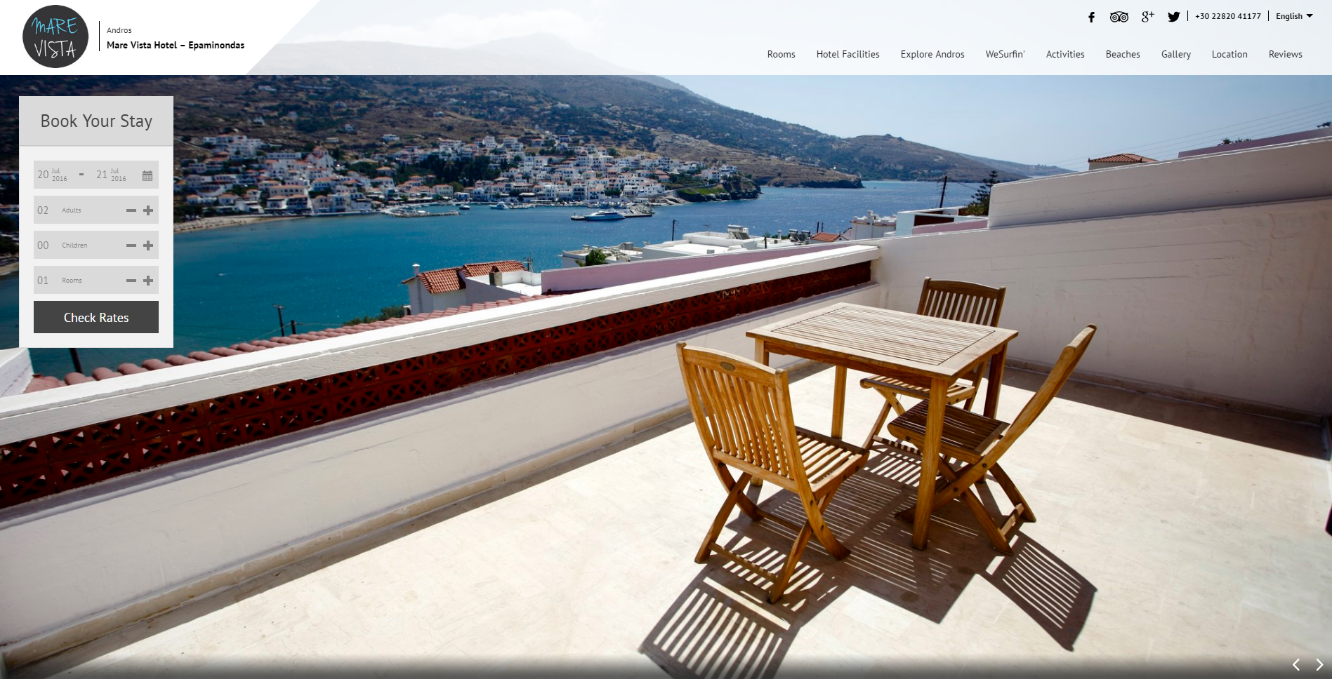
Before we move on to best practice #3, let’s look at a good example of a property that knows its guests, what they’re looking for, and tells a very compelling visual story; the Mare Vista in the Greek Islands.
The moment you land on their website you’re greeted with stunning, crisp visuals of the hotel and surrounding areas. You feel as if you’re already there.

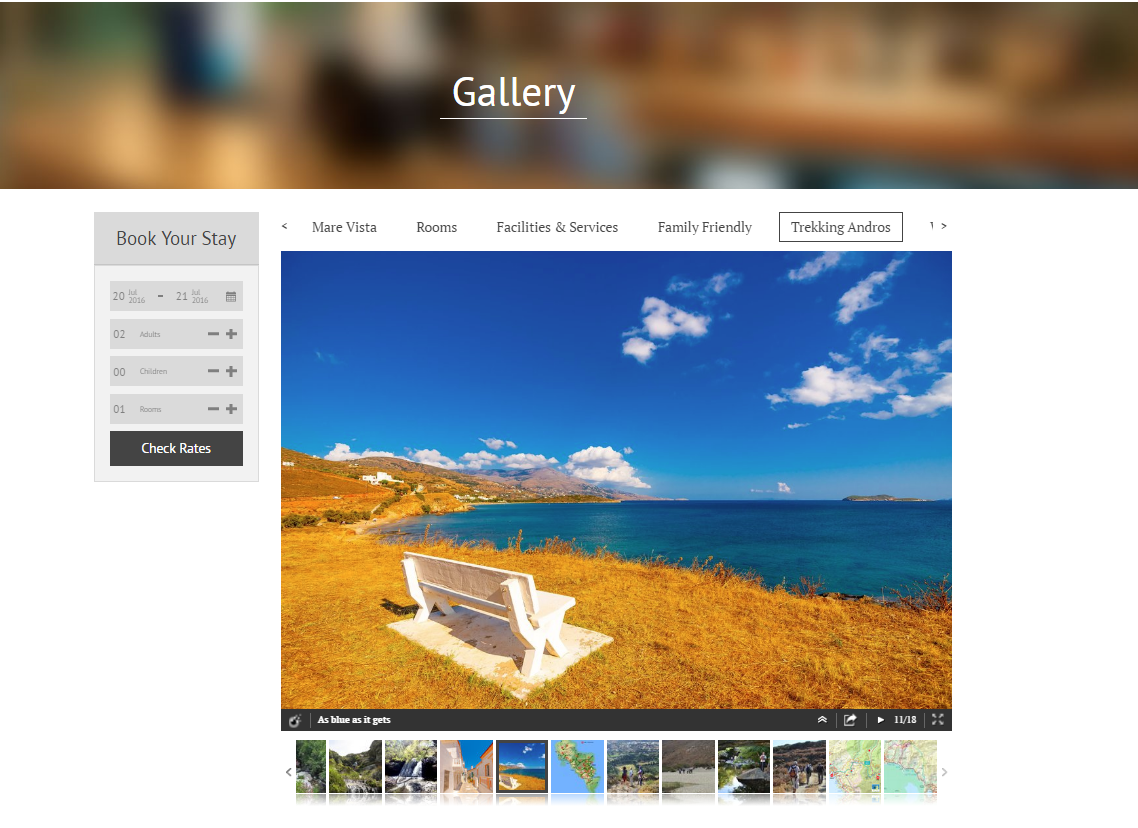
They organize their media into easy-to-navigate web galleries, so you can really get a feel for the property and surrounding area.

The Mare Vista uses visuals to target specific travelers extremely well. They have curated media to show that they’re family friendly and a hot spot for trekking and surfing.
Visitors to your website need to have their questions answered before they book a room. The key is to facilitate this on your site so that they aren’t tempted to go elsewhere.
3. Use Social Proof
As consumers move further down the purchase path, it’s important to provide social proof. Social proof is independent third-party feedback that gives travel shoppers the boost of confidence they need to book your hotel. It can include anything generated by someone else – reviews, ratings, awards – that tell people about your property.
Its impact is powerful, especially when it comes to booking travel. Consumers trust peer recommendations over paid advertisements. In fact, more than half of your potential guests won’t book a hotel without reviews. And if two hotels are priced the same, travel shoppers are nearly 4x more likely to choose the hotel with higher review scores, and 76% will pay more for a hotel with better reviews. Those are powerful and convincing numbers!
It’s important to provide social proof on your website, so travel shoppers don’t have to go somewhere else to find it.
Here are a few ways you can incorporate social proof into your website:
- Bring glowing reviews right to your site. TripAdvisor makes this quite easy by offering embeddable widgets.
- Provide user generated content by making your social media links prominent. Better yet, pull photos and videos that your guests are posting on social media right into your website.
- Brag when you’ve received awards (it’s OK). A lot of sites put their awards at the bottom of the page. Instead, move them to the top so people actually see them.
- Consumers have a tendency to be wary of making online transactions, so alleviate their fears by adding third-party certification icons that indicate that transactions are safe and secure.
- Provide evidence that others are bookings. Travel shoppers don’t want to miss out a great deal and it reassures them knowing that other people want to stay at your property too.
- Speak to the company that powers your booking engine to see if they offer any third-party certification icons or technology to provide booking evidence right in the booking path.
4. Make it Easy to Book
Cart abandonment is a real problem for e-commerce sites, including travel websites. In fact, 81% of online travel bookings are abandoned, according to a study by SalesCycle. So how can we fix this?
The first step is to make sure your “Book Now” button is prominently displayed on every page of your website. If consumers can’t find it quickly, they’ll move on.

Next, ensure that completing a booking is easy. Optimizing your booking process is critical to having a website that converts. You can simplify the path to purchase by following these 8 recommendations:
- Only ask for information you need (you lose 10% of bookings with every unnecessary form field)
- Explain why you need the information you’re collecting
- Ensure travel shoppers can book with minimal clicks and pages
- Have a clear call-to-action (don’t make them guess where to click)
- Don’t add additional calls-to-action that distract from check-out (like registering for an e-newsletter – that can be displayed after the reservation is complete)
- Assure customers that their check-out is secure
- Assure customers that they’re getting the best deal
- Add a sense of urgency to ensure they book now
5. Get Mobile
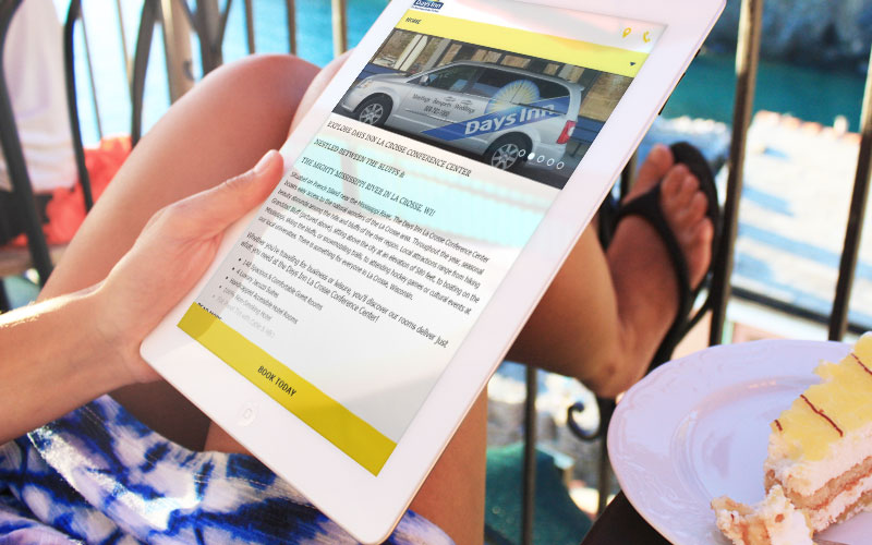
It’s predicted that in 2016, 52% of online travel bookings in the US will be made on mobile devices. And that number continues to grow year-over-year. Mobile is not a trend, it’s here to stay. If you’re not offering a great mobile experience with superior usability, social proof and an optimized checkout, you’re not going to drive the performance you want.

Elements of a mobile-friendly website include:
- Avoiding Flash and other software that doesn’t work on mobile devices.
- Having quick load times. 40% of shoppers won’t wait any longer than 3 seconds before abandoning a slow-loading mobile site.
- Automatically resizing photos and text to be proportional to each screen size. That way visitors don’t need to scroll across or zoom in on content.
- Links are separated by enough space, to make for easy tapping.
By following these best practices, you’ll be well on your way to having a high-performing website that converts, and helps you reach your occupancy and revenue targets.
For more helpful tips on this topic, be sure to download our free eBook, The Hotel Marketer’s Playbook for Creating, Managing and Measuring a High-Converting Website.
Vizlly is a Multi-Channel Digital Marketing System that incorporates all of these best practices. The result is a high-performing hotel website that converts. Test drive Vizlly for yourself with a free 30-day free trial. No credit card required, no strings attached.


